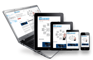
This is where the need of responsive web designing comes in. In fact, responsive web designing has already grasped the attention of many recently. The idea refers to an adaptive that would give a website a built-in ability to fit and scale according to the dimensions of the screen, whether it is a hand-held phone or a tablet device.
The influential Responsive Web Design was first published in 2011 by Ethan Marcotte, and tech observers are now expecting it to steal the limelight this year. Contrary to the traditional fixed-width websites, this adaptive web experience automatically fit images and grids perfectly to the screen with its enhanced flexibility and fluidity.
The idea was not hard to imagine. You just need to make your browser window smaller in a desktop browser. You will easily notice how the images and content shrink to fit the screen, as well as the disappearance of the sidebar.
The Question is – Why Bother About It Now?
This is because more and more people are switching from the once-dominant PC world to buying tablets and smartphones. It is expected that sales of tablet devices will peak at 100 million. Furthermore, more mobile subscribers own a Smartphone now than feature phone.
Hence, for those in the business in the web design and development sector, this implies being ready for all the various available screens that have recently emerged. One option can be to have a mobile app. However, this requires building up apps for every app store out there, which can be quite expensive.
For this reason, the focus is more on responsive websites. It is obviously more beneficial to own an adaptive screen. Building a website that can work with any screen type is surely an asset.
Remember, the more your users are satisfied, the more businesses your website will generate. ‘Satisfaction’ in this case refers to ease of access and engagement. Loyal customers are the ones who visit your website regularly, and they won’t be there if they have troubles with your website.
The purpose here is not to encourage the development of applications. Instead, the goal here is to educate you on responsive web design, something that can do wonders for your business in the upcoming technological environment.